

Refined Logo, New Title Logo, Major Updates To The Donald Louch Website, and More
Loading Content
If the content is still not loaded after a minute please contact Donald Louch at hello@donaldlouch.ca for further assistance.
If the content is still not loaded after a minute please contact Donald Louch at hello@donaldlouch.ca for further assistance.
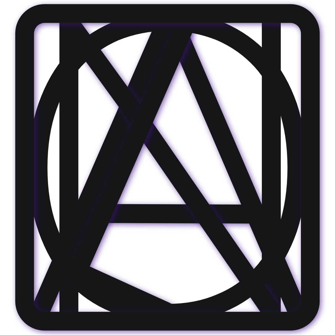
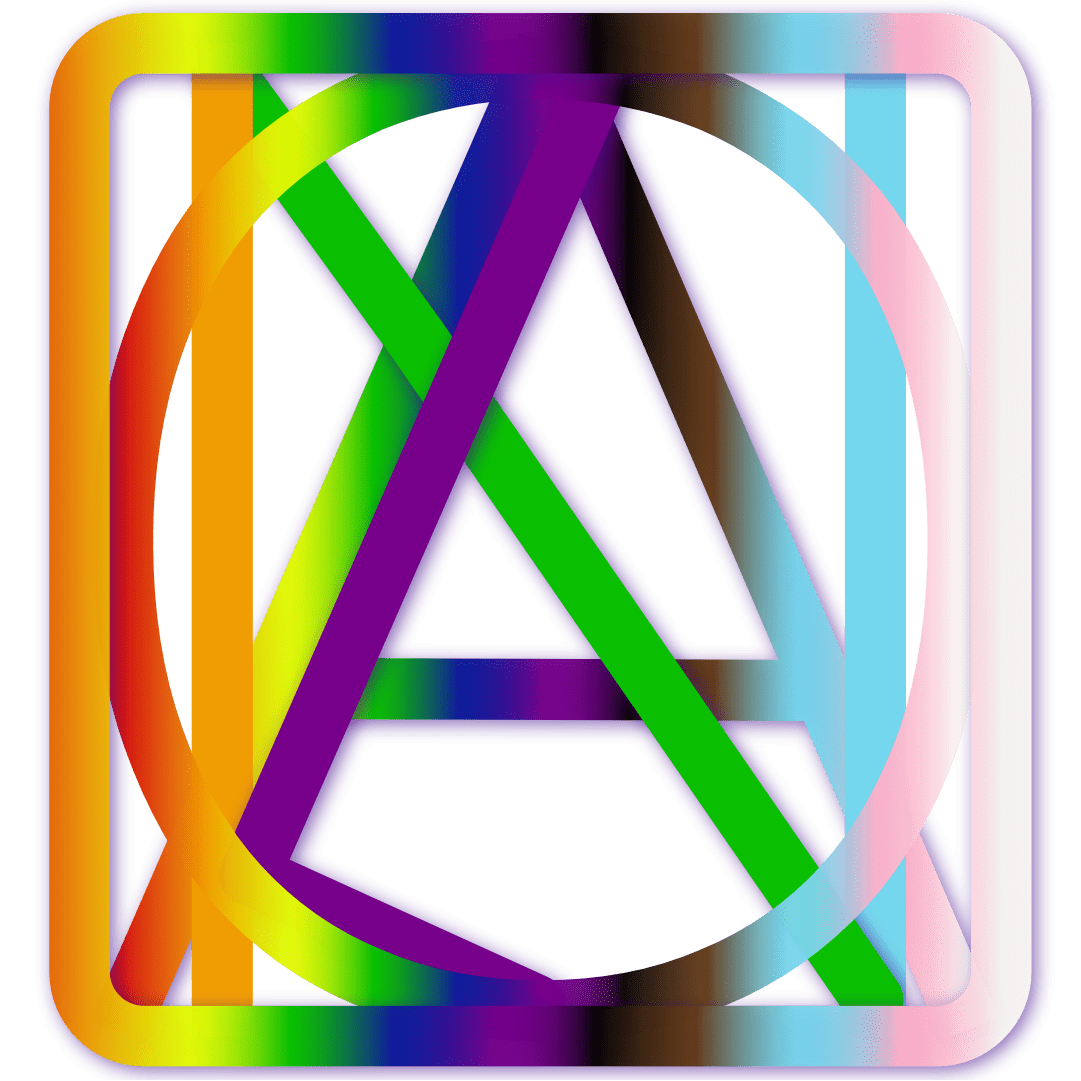
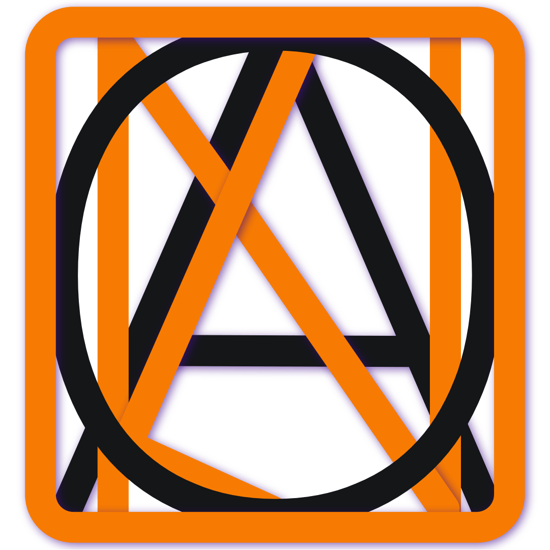
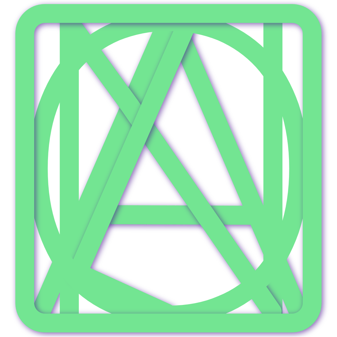
I am excited to unveil my new set of logos and title logos 🎉
The new logo is a refinement of my previous logo. Where I've kept the same base shape and colours. I've added more depth and refined the edges on the logo, which allows me to make them scaleable. In addition, by making the logo have further depth, I can have more custom colours. With that, I have made different variations of the logo. At this time, I have the main variant
A Holiday variant
An Orange Shirt Day and Halloween variant
A Pride variant
Black, white, purple, orange, and green variants, as well 🎉
More to come!


As for the title logo, I have modernized it and made it more professional. On the left side of the title, I now display my main variant of the new logo, followed by my name in a thicker and cleaner font. The font is the same main font that I use across my productions. In addition, I have also added the same depth effects that I used from the logos in the title logo.


With the new logo and title logo, I have further updated my banner images for my social media. The banner image displays
My new tagline: "Hello, I'm {my updated Main Title Logo} and; I'm a Web Developer and Digital Content Creator."
An image of an ocean with rocks
And the banner image is overlayed with my gradient
The image at the top of this post (the thumbnail) is what the banner image looks like
Not only am I excited to unveil my new logo and title logo, but I'm also excited to announce that I have fixed several bugs that have been present in my website and even updated some of the UI elements of the website 🎉 Which I have internally titled the update version 28! Going forward I'll be labeling version as my current age . month . day.
I have fixed the long-standing bug that interacts with the pagination feature within my blog, category, tags feeds, and internal pages. The pagination is now working how it's supposed to. Additionally, when a page only has one page of content, to display of the pagination will be hidden. Furthermore, after visiting the fifth page, you now view the last and next three pages. Likewise, I have made it easier to see the current page with bolder and large text.
I have resolved the layout issues within posts that contain images. The image grids would only show pictures in a two-column view and have it squished to one-half of the screen.
I have added a symbol on the list elements to guide between different items in a list.
I am further excited to announce and introduce Pinned Posts! With this new feature, I'll be pinning posts in which are important on the top of the Blog Feed and embedded within the About Me Links section.
Similarly to the banner image update, I have updated the home/portfolio/and blog page hero sections to make it easier to read, added new pictures, and updated the tagline. In the past, the picture in all the hero sections was a picture of myself. I have now refactored the code to allow for more flexibility and enabled the ability to have different images on each hero section. Currently on the:
Home Hero Section: I have a picture of a snowman to celebrate the upcoming Holiday Season.
Portfolio Hero Section: The picture of myself that I had across all the hero sections is the picture that is, displayed in the Portfolio Hero Section.
Blog Feed Hero Section: I have a picture that I took of the ocean and rocks from the same shoot that I took the picture in the banner image.
I have further updated the tag lines: "Hello, I'm Donald Louch and; I'm a Web Developer and Digital Content Creator."
By using, the new title logo, the size of the navigation bar is now smaller.
I have further done some initial fixes with the category section within post. Now, when a post has more than one category, it will now display each category as it's own category.
Within blog posts that contains tabs, it is now fixed and will display the content properly.
Furthermore, I've made some UI refinements, using thinner icons across the website, making the website more mobile-friendly, and other UI refinements.